
Redesigning
Desktop Media
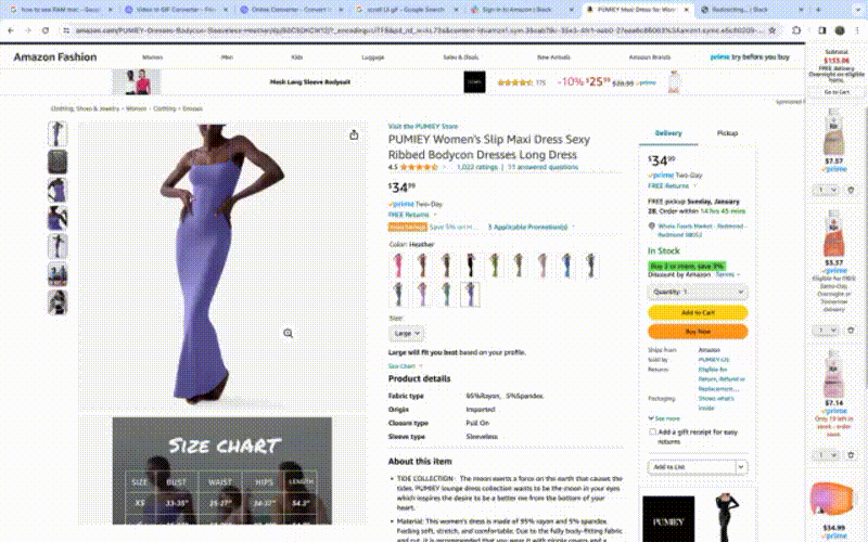
Project context
The desktop design had not been updated in over 5 year. The team had a goal around elevating the visual design and improving the usability of image based evaluation on the Amazon Fashion detail page on desktop
A vertical scroll would optimize the restate while making the page more visually forward
Based on research, image based evaluation and the ability to zoom were extremely important to evaluate the product.
Customers had reported being overwhelmed by text on the detail page. We wanted to find ways to

Design thinking
Thumbnail navigation was the default on Amazon. could we remove it an instead use that space to make images larger?
What would be the most optimal way to layout images that help evaluate the product best?
How would the vertical scrolling of images behavior affect product information on the left and page level scrolling?
What would be the most efficient zoom functionality for the new experience?
How would the peak state and design best adapt to the array of desktop screen sizes out there.


Proof of concept testing
Based on the variables I created 3 prototypes with a combination of different zoom, scroll and image layout
The prototypes were tested across 18 participants in an unmoderated recorded session with action based questions where customers walked us through their experience and feedback while completing tasks.
Overall Customers gave a very positive reaction to the prototypes helping us narrow down our A/B testing publishing experience
Learning Highlights
Ease of scrolling
Participants easily scrolled through images on all three prototype versions and did not mention any difficulty doing so.When asked to navigate through the available images, participants found scrolling to be intuitive and easy across all prototypes. Many thought to click on the images and used the front and back arrows to browse through the carousel of images in the modal.
Visually familiar
Many participants noted this experience felt familiar and did not discuss visual differences in the prototype explicitly. Those who did mention the changes to the new media block and associated scrolling interaction, liked the new direction. Participants who pointed the differences out felt the new media block was unique and felt positively about the design compared to what they’ve seen before while shopping on Amazon for clothing. Participants found it helpful to see multiple images at once and liked seeing images within the grid-view.
Zooming needs
Some participants found the default zoom on hover to be unexpected and wanted to adjust the level of zoom to view close-up details of the dress. Because it got in the way of scrolling through the images, some participants did not like that the image zoomed automatically on hover. They also felt that it did not offer a close enough view of the dress and expected to be able to zoom in and out using plus/minus (+/-) options. Participants found zooming to be very important as it helps them see things like material quality, print/pattern details, and other intricate parts of the clothing item
Impact
Incremental steps
To get to the ideal state my approach has always been to find simple small steps to improve the experience that also are necessry for the bigger picture to suceed.


Final Design
Thumbnail design
Customers that don’t intuitively scroll may continue to use the thumbnails like they previously did. This is a conscious choice to build a soft learning curve.
Inline zooming
The line zoom on click helps customers stay in context and still see product detail side by side.
Intuitive scroll
When the customer scrolls through all the images, the rest of the page automatically starts scrolling up.
Responsive design
The media block optimizes height to fit the view port but always have a peak state in different screen sizes.
